When I shared the conversation with my husband where he told me I would change my mind fifty more times about paint, I didn't realize just how right he would be.
No, we're not approaching thirteen paint samples like we did in the kitchen. But we're up to 8. Two Valspar colors, two Martha Stewart colors, two standard Sherwin Williams colors, one SW color lightened a little bit, and one color where I told the guy behind the counter that it wasn't quite light enough and a little too blue, maybe not green enough, you know? Thankfully, he did know, and he mixed me a sample that is just labeled "Gray."
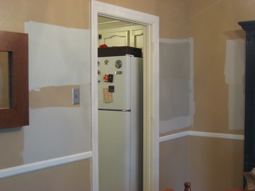
We have big gray splotches all around the room, on most expanses of available wall space. The problem with a space this big, that includes a dining room, a big, long, not very well lit living room, a staircase and a very poorly lit hallway, is that we like different colors in different spaces.
In the dining room, near the window and the front door?
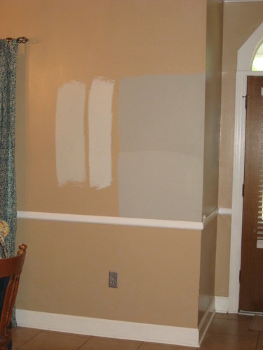
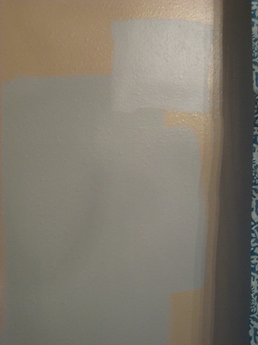
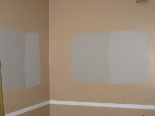
I really love that top color, which is SW Mindful Gray. In case you're wondering, the bottom color is "Gray" and the other two are SW Agreeable Gray and a lighter version of the same.
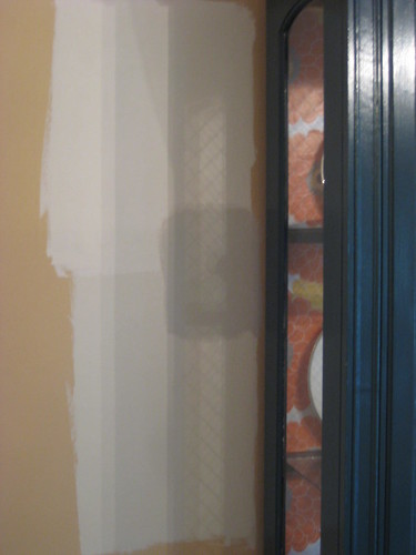
I'm also loving Mindful Gray on the other dining room wall, looking into the kitchen (on top, the bottom is "gray"). Please excuse the fuzziness of some of these photos. I took most without a flash to get the truest color.
Mindful Gray also looks pretty great with our mirror, and since gray+wood tone is one of my favorite looks, that's a big deal to me.

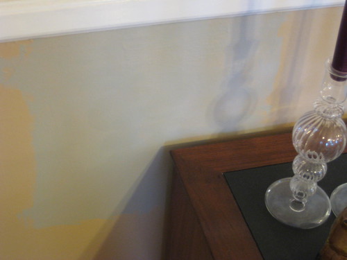
Elsewhere in the dining room, though, "gray" is the front runner. It looks fabulous next to our funky blue china cabinet. It's the small patch in the middle. The others are Agreeable Gray and the lighter version.
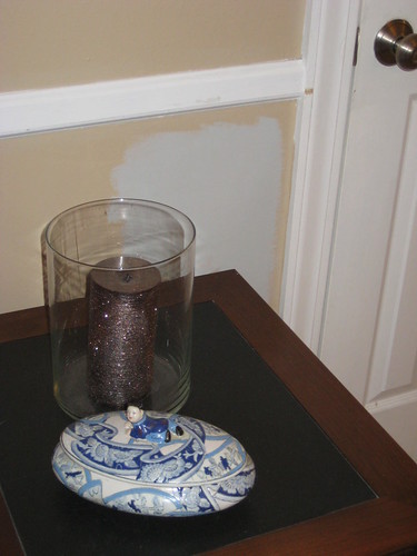
We have so many samples up, we painted samples on top of samples. In this picture you can see all the colors previously mentioned, plus Valspar Stony Path and a little bit of Valspar Seashell Gray under a newer sample.
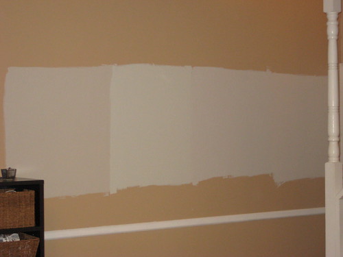
And here, we found out that SW Mindful Gray and Martha Stewart Bedford Gray are pretty much the same color. The big patch is Bedford Gray, with Mindful gray to the right and "gray" up top.
In the living room things get a little more complicated.
At the base of the staircase Agreeable Gray (left) looks perfect, while Stony Path, Seashell Gray, and the lighter AG are all too something.
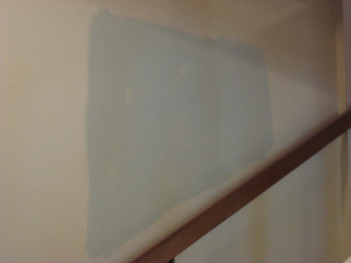
But up the stairs, "gray," to the right of Mindful Gray, has me ready to paint.
On the other side of the room, I'm stuck thinking Mindful gray is too dark. (L to R, Bedford Gray, Martha Stewart Nimbus Cloud, Mindful Gray, and "Gray")
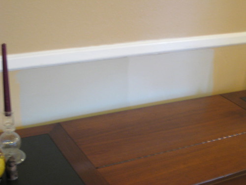
But in the end, it's the media console that has me convinced.
Bedford Gray
Mindful Gray and "gray"
And Nimbus Cloud
Mindful Gray is the one. It's got just enough green and not so much blue that I'm worried about it not coming up neutral. It looks great with our curtain fabric (in fact, it's almost the exact color of the gray stripe!). And it dark enough to give me a cozy feeling, but not so dark that I feel like I'll need a headlamp to get around. Lucky for me, Duration paint is 20% off until the 31st, so I'll be picking up the 7 gallons very soon!
But just so you know, if anyone in real life asks me, the color is called Heavy Goose.